Understanding Color Psychology in Abstract Paintings
The Power of Colors in Abstract Art
Unlike realistic art, which relies on recognizable subjects, abstract art communicates through tones, contrasts, and harmonies. Each shade has the power to spark a specific mood—whether it’s calmness, joy, passion, or strength. Understanding this psychology helps both collectors and art lovers choose paintings that resonate with their personal energy.
Common Colors and Their Meanings
· Blue – Peace, calmness, spirituality, and trust. Perfect for meditation corners or bedrooms.
· Red – Energy, passion, and strength. Works well in living rooms or creative spaces where vitality is needed.
· Yellow – Happiness, positivity, and warmth. A cheerful addition to kitchens, study areas, or family spaces.
· Green – Renewal, balance, and nature. Ideal for spaces that need harmony and freshness.
· White – Purity, simplicity, and clarity. Creates a feeling of openness and peace.
· Black – Elegance, mystery, and depth. A strong choice for modern, minimalistic interiors.
Choosing Colors for Your Space
When selecting an abstract painting, think about the mood you want to create:
· A vibrant multi-color abstract can energize your living room.
· Soft pastels can make bedrooms soothing and restful.
· Bold contrasts can add drama and sophistication to modern interiors.
By aligning colors with your emotions and environment, you transform not just the wall but the energy of the entire room.
Final Thoughts
Abstract art speaks through colors, touching emotions beyond words. By understanding color psychology, you can choose paintings that not only enhance your décor but also uplift your spirit.
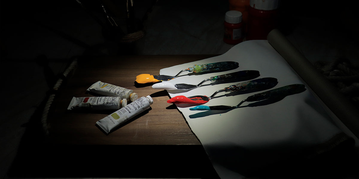
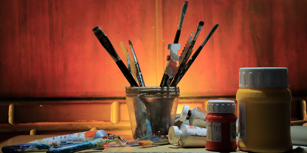
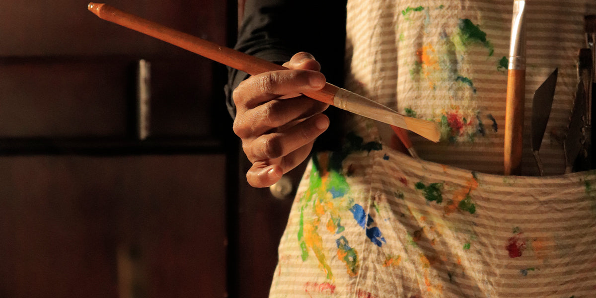
At Lavanya Art Studio, I create handcrafted abstract artworks where each color is thoughtfully chosen to inspire joy, peace, and harmony in modern homes.


