Understanding Color Psychology in Abstract Paintings: How Colors Influence Mood and Modern Interiors
Colors are far more than visual elements—they influence our emotions, shape our experiences, and affect the atmosphere of the spaces we live in. Whether we realize it or not, the colors surrounding us can make us feel calm, energized, inspired, or relaxed.
In abstract paintings, color becomes the heart of the artwork. Without relying on recognizable subjects or detailed imagery, abstract art communicates through color, texture, movement, and composition. Every shade, contrast, and brushstroke contributes to the emotions the artwork evokes, making color psychology one of the most important aspects of contemporary abstract art.
At Lavanya Art Studio, every handmade abstract painting is thoughtfully designed with this understanding in mind. The careful selection of colors, textures, and compositions ensures that each artwork not only enhances a space visually but also creates a meaningful emotional connection.
What Is Color Psychology?
Color psychology is the study of how different colors influence human emotions, thoughts, and behavior. While personal experiences and cultural backgrounds can shape individual interpretations, many colors evoke universal emotional responses.
Interior designers, architects, artists, and branding professionals often use color psychology to create environments that encourage specific moods and experiences. The same principle applies to abstract paintings, where color often becomes the primary language of expression.
A well-chosen painting has the ability to transform not only the appearance of a room but also the way it feels.
Why Color Plays a Central Role in Abstract Art
Unlike traditional paintings that tell stories through recognizable figures or landscapes, abstract art allows viewers to interpret the artwork through emotion rather than representation.
Textures, movement, shapes, and especially colors become the visual language that connects with the viewer.
This freedom allows every person to experience an abstract painting differently. The same artwork may evoke calmness in one person, creativity in another, or nostalgia in someone else.
That emotional connection is what makes abstract art timeless and deeply personal.
Understanding the Meaning of Colors in Abstract Paintings
Blue – Calm, Peace, and Serenity
Blue is one of the most soothing colors in art and interior design. It represents tranquility, stability, wisdom, and spiritual depth.
Red – Energy, Passion, and Confidence
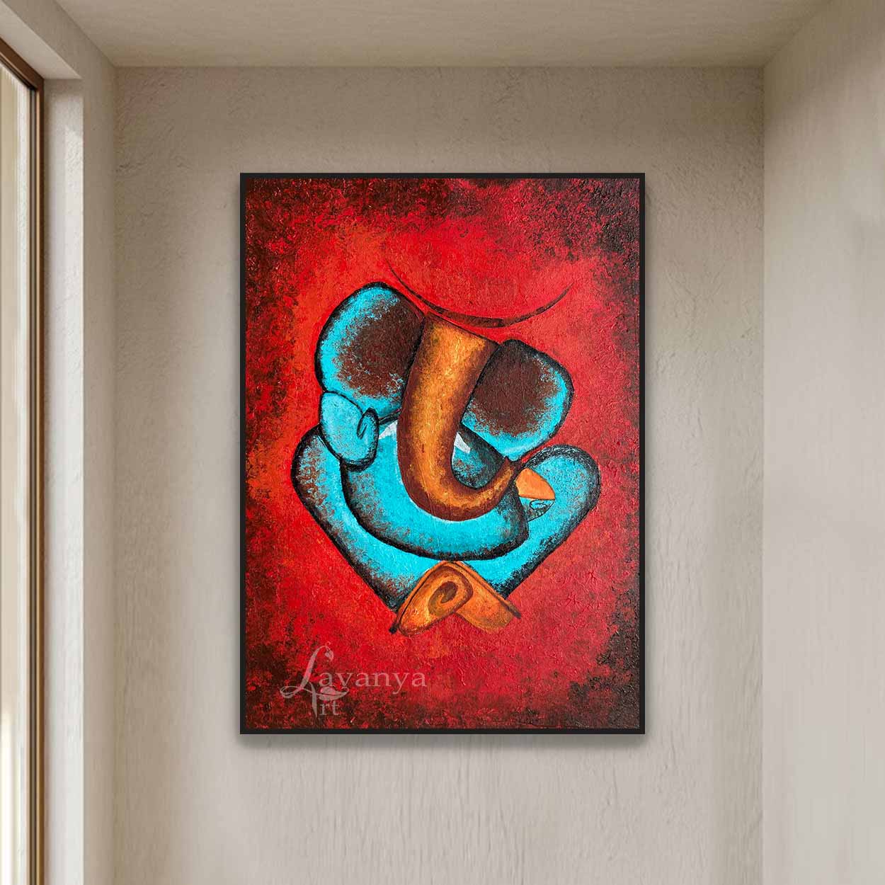
Red is bold, expressive, and full of vitality. It symbolizes passion, strength, courage, and determination.
Yellow – Joy, Optimism, and Creativity
Yellow is associated with happiness, positivity, optimism, and intellectual energy.
Green – Harmony, Growth, and Renewal
Inspired by nature, green represents balance, renewal, freshness, and well-being.
White – Simplicity, Purity, and Elegance
White symbolizes clarity, openness, and simplicity.
Black – Sophistication, Depth, and Modern Luxury
Black is often associated with strength, elegance, mystery, and refinement.
Gold – Luxury, Warmth, and Timeless Beauty
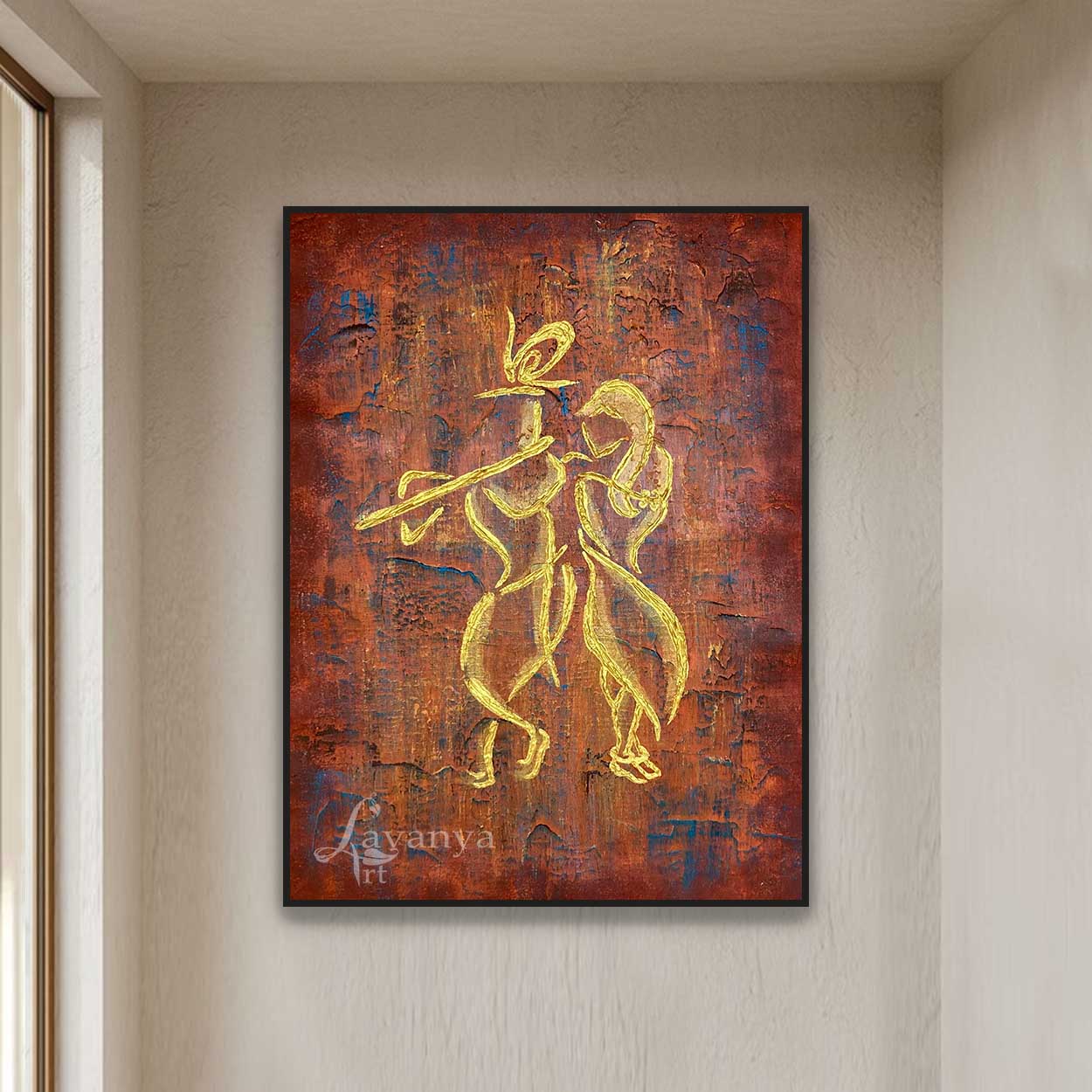
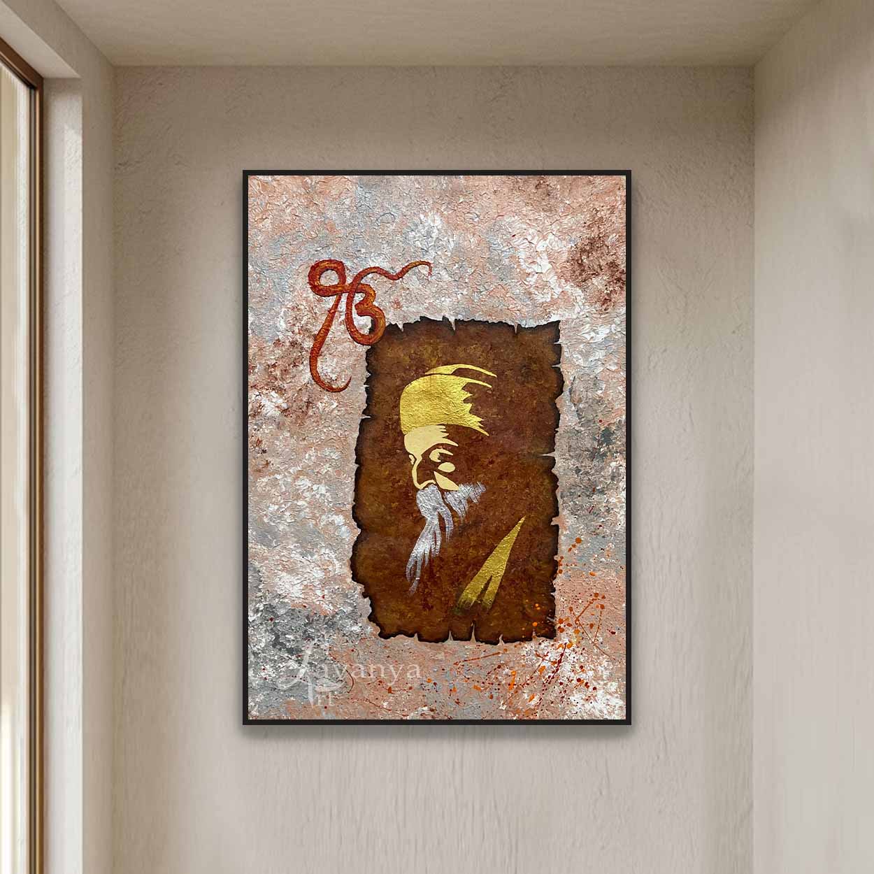
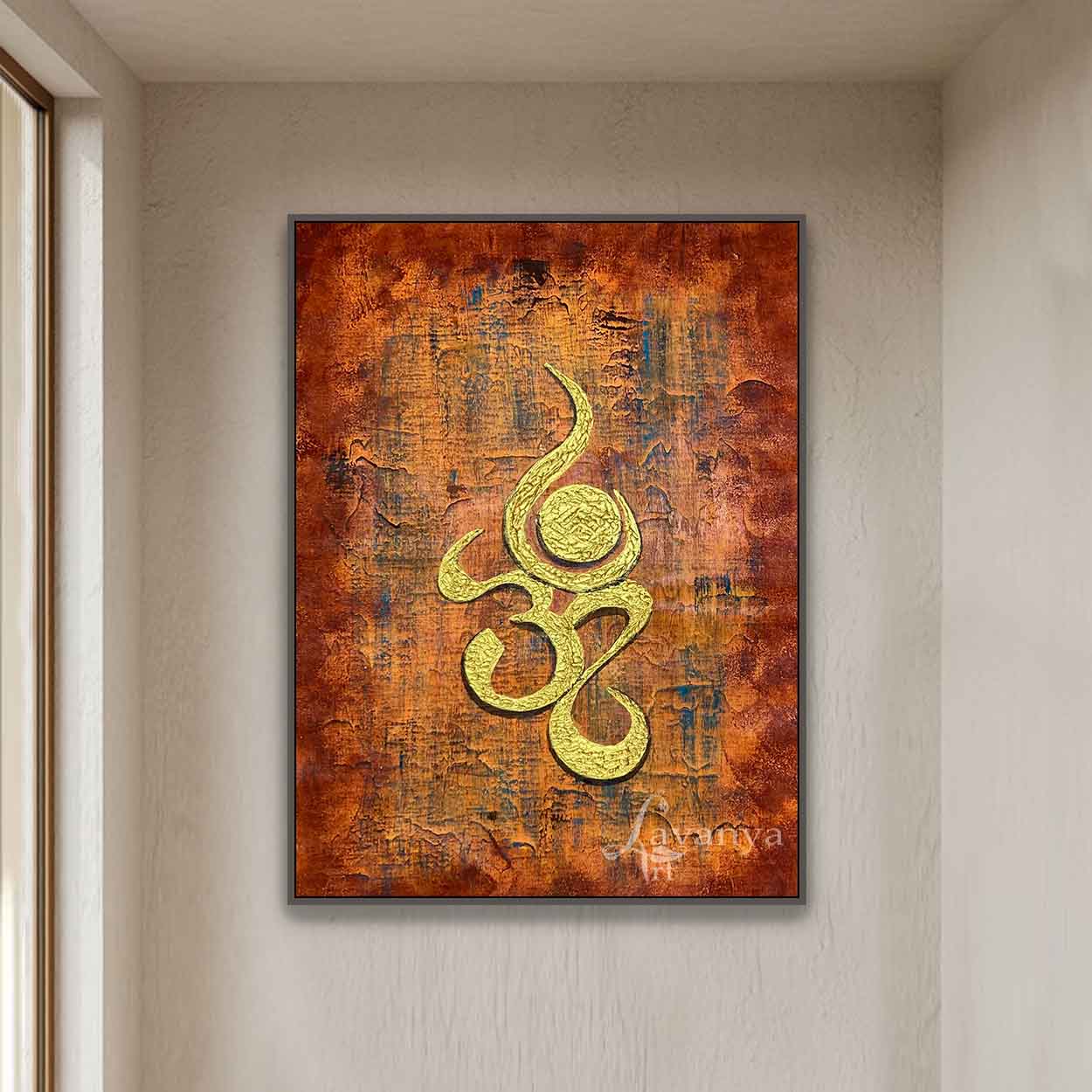
Gold has long symbolized prosperity, success, and elegance. In contemporary abstract paintings, gold accents add richness, warmth, and a luxurious finish.
Gold complements neutral interiors beautifully and creates striking focal points without overpowering the overall design.
It pairs exceptionally well with white, beige, grey, black, and earthy tones, making it a popular choice for luxury homes and premium commercial spaces.
Choosing the Right Abstract Painting for Your Space
When selecting an abstract painting, consider not only its colours but also the atmosphere you want to create.
Ask yourself:
- Do you want the room to feel calm and relaxing?
- Should the artwork become a bold focal point?
- Are you creating an elegant luxury interior?
- Do you want the space to feel warm and welcoming?
- Does the artwork need to inspire creativity or mindfulness?
Choosing artwork based on emotion rather than simply matching colours often creates interiors that feel more balanced and personal.
Matching Abstract Art with Different Rooms
Different spaces serve different purposes, and the colours in your artwork can enhance those experiences.
Living Room
Choose paintings with warm neutrals, gold accents, earthy tones, or vibrant colours that encourage conversation and create an inviting atmosphere.
Bedroom
Soft blues, gentle greens, whites, and muted earthy tones help create a peaceful and relaxing environment.
Home Office
Balanced compositions with blues, greens, and subtle neutrals encourage focus, creativity, and productivity.
Dining Area
Warm colours such as gold, terracotta, deep reds, and textured neutrals create a welcoming and sophisticated dining experience.
Meditation or Yoga Space
Calming whites, soft blues, sage greens, and minimalist compositions support mindfulness and inner peace.
The Role of Texture in Color Psychology
Color is only one part of an abstract painting.
Texture adds another emotional dimension.
At Lavanya Art Studio, many abstract paintings feature rich handcrafted textures that interact with natural and artificial light throughout the day. These changing reflections create depth, movement, and visual interest that flat printed artwork simply cannot achieve.
The combination of texture and carefully selected colours gives every painting its own personality and emotional presence.
Handmade Abstract Paintings for Contemporary Interiors
Every abstract painting at Lavanya Art Studio is individually handcrafted by Tejasvi Patel, an Indian contemporary and abstract artist with over 22 years of artistic experience.
Rather than following temporary design trends, each artwork is created to complement modern interiors while remaining timeless in style.
Every painting features:
- Original handcrafted artwork
- Rich layered textures
- Premium-quality materials
- Contemporary compositions
- Carefully balanced colour palettes
- Thoughtful artistic craftsmanship
The result is artwork that becomes more than wall décor—it becomes part of the atmosphere of a home.
Final Thoughts
Color has the remarkable ability to influence emotions, shape experiences, and transform interiors. In abstract paintings, where colour becomes the primary language of expression, choosing the right artwork is about more than aesthetics—it's about creating a space that reflects your personality and enhances the way you live.
Whether you are drawn to calming blues, energizing reds, elegant neutrals, or luxurious gold textures, the right painting can bring warmth, harmony, and lasting beauty into your home.
At Lavanya Art Studio, every handmade abstract painting is thoughtfully created with this philosophy in mind. Through carefully chosen colours, rich textures, and contemporary compositions, each artwork is designed to inspire peace, creativity, and emotional connection while complementing the elegance of modern interiors.
Frequently Asked Questions (FAQs)
How does color psychology influence abstract paintings?
Color psychology explores how different colors affect emotions and behavior. In abstract paintings, colors play a central role in creating moods such as calmness, energy, happiness, or balance.
Which color is best for a peaceful home?
Soft blues, greens, whites, and neutral tones are often associated with relaxation, harmony, and tranquility, making them ideal for bedrooms, meditation spaces, and living rooms.
Are abstract paintings suitable for modern interiors?
Yes. Contemporary abstract paintings are highly versatile and complement a wide range of interior styles, including minimalist, modern, Scandinavian, and luxury spaces.
Why choose handmade abstract paintings?
Handmade paintings offer originality, texture, craftsmanship, and individuality that cannot be replicated by mass-produced prints. Every piece is unique and adds character to a space.